DIY Heart Rate Monitor Using Your Smartphone
Recently I’ve been quite interested in biomedical sensors, namely Photoplethysmogram (or PPG) sensors. Essentially, a PPG takes advantage of the optical properties of skin to measure the rate of absorption or reflection of different wavelengths of light. A clinical PPG device is typically clamped on your finger and your finger is illuminated on one side and the response recorded on the opposite side via a photo-detector. This is referred to as a transmissive sensor. Commercial devices, such as those found in wearables, tend to rely on the reflective properties of skin to measure heart rate, but the concept is similar.
This post will go over how to record your own heart-rate by using your phone’s camera and flash to illuminate your finger and measure the change in light absorption. Although the set up is similar to a reflective PPG, the actual response we record will more closely resemble a transmissive PPG.
Table of Contents
- Background
- Prerequisites
- Recording the Heart-rate
- Extracting Heart-rate from Video
- Heart-rate After Cardio
- Final Thoughts
Background
In order to understand why this experiment works, we should look into a bit of the background of PPGs first. As previously mentioned, PPG sensors rely on reflecting light off of the skin and observing the response on a photo-detector, or by observing the skin’s absorption of light. Now, why can this measure heart-rate? Well, as the heart pumps blood through to the extremities (wrist, finger, etc) the volume of blood being moved ends up changing. This change in blood volume ends up changing the way the skin absorbs and reflects light. By measuring this change in light absorption, we can extract a measure of how quickly the volume of blood is changing and, thus, extract our heart-rate.
So ultimately we need a way to transmit light (ideally at a wavelength that our skin is good at reflecting) and then a way to measure this reflected light. Luckily, everyone with a camera on their phone (and a flash!) already has this capability!
Prerequisites
- Phone with Camera and Flash (I’m using a Nexus 5X, for reference)
- Python 3+ with the following packages:
- numpy
- imageio
- matplotlib
- ffmpeg
Note, I recommend installing Anaconda as it’s really awesome and contains most packages you’ll need. You’ll still need to install the imageio PyPi package as well as an ffmpeg install which can be performed with the following command if using Anaconda:
conda install ffmpeg -c conda-forge
Recording the Heart-rate
Before we can extract the heart-rate, we must record it. This is the easy part.
- Open your camera app on your phone and prepare to record video (don’t start the recording yet, though).
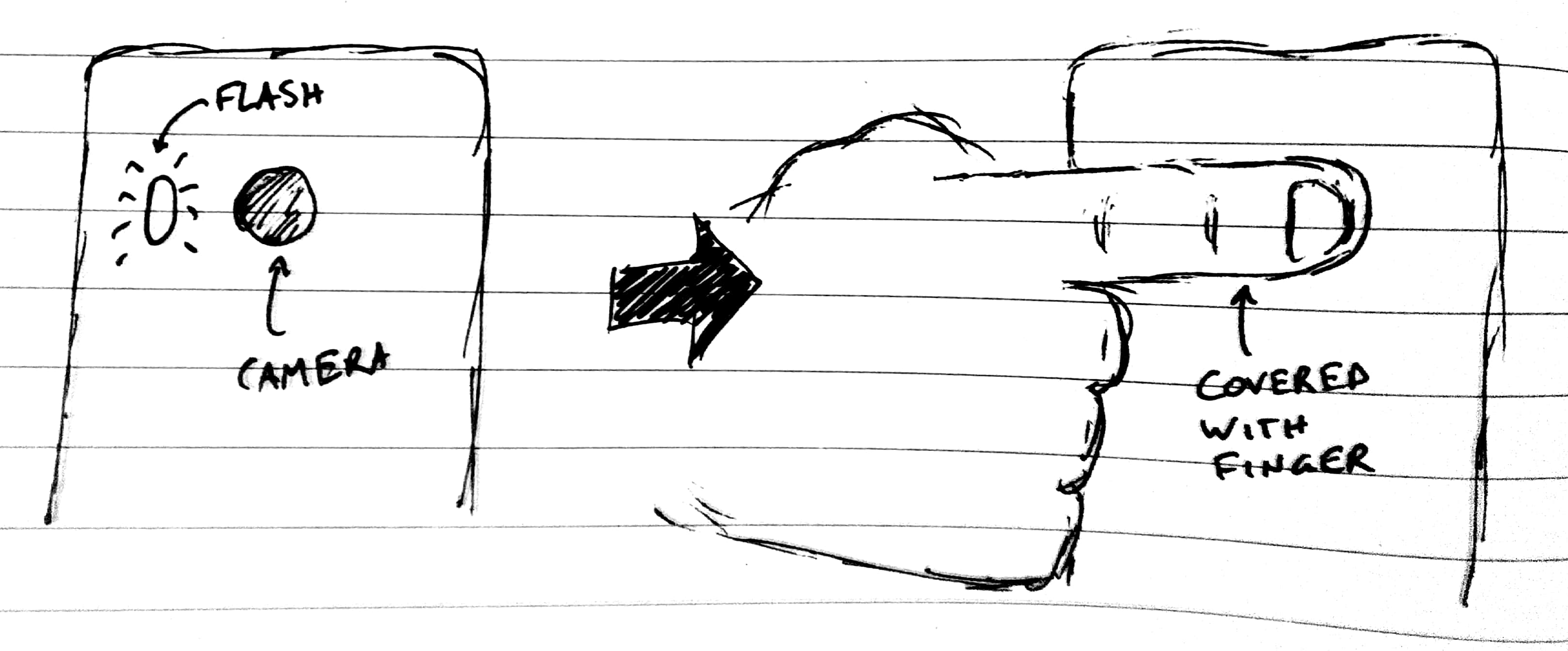
- Turn on the flash.
- Place your finger such that it covers both the flash AND the camera, like the image below. Note that you need to adjust this based on your flash/camera layout. Just make sure your finger covers both.
- Record a video. Duration is up to you, but I found that 20-30s videos work the best.
- Save video to computer where you will be post-processing.
Extracting Heart-rate from Video
Now for the fun part: post-processing. I’ll post each step of the code with some explanation, and at the end of the post I’ll give the full code.
Read in Video
Step 1 is also pretty easy, we just need to read in the video. This will use the aforementioned ffmpeg library to read through the video and store the red, green, and blue pixel data for every pixel in every frame. Depending on the length of the video, this step can take a while to complete. In my case, I had a 30s video recorded at 1920x1080 at 30 FPS which results in an uncompressed 5.6 GB of data (orders of magnitude smaller with mpeg compression, but you get my point: be patient).
import numpy as np
import imageio

video = imageio.get_reader('your_video.mp4', 'ffmpeg')
Extract Red/Green/Blue Channels
This next part does a few very important things. First, we iterate over the video frame by frame and, at each frame, we average every single pixel in the frame. Why? Well, ultimately, we don’t care about the intensity of individual pixels. What we care about is the total light change over the whole finger, so we get much better data when we average each pixel as we remove the variation of small localized areas and have a much larger area to work with. Basically, we’re using our expensive CMOS image sensor as a single photodiode. Talk about overkill…
Once we create our single massive pixel, we need to extract the RGB channels so we can process them independently. The code below specifically saves each color, but I only end up using the red channel. This is because skin is really bad at absorbing red light, so the intensity of the red channel is far superior to that of blue or green. Due to this fact, the red light will undoubtedly provide us with the best information.
colors = {'red': [], 'green': [], 'blue': []}
for frame in video:
    # Average all pixels
    lumped_pixel = np.mean(frame, axis(0,1))
    colors['red'].append(lumped_pixel[0])
    colors['green'].append(lumped_pixel[1])
    colors['blue'].append(lumped_pixel[2])
Another step we can take (but is not necessary) is to normalize the channels to full-scale, or 255 (8-bits per channel):
for key in colors:
    colors[key] = np.divide(colors[key], 255)
Plot Time-Series Data
So now we’ve got a series of data that represents the change in absorption of the color red over every frame. The first thing we want to do is plot it to ensure that we do, in fact, see a variation over time. Let’s set up the plot style first so that we can make our graphs pretty. Here, I also set the fps variable which we will use to convert the frame to a unit of time. Adjust this variable based on your camera’s settings.
import matplotlib.pyplot as plt
plt.style.use('fivethirtyeight')
fps = 30 # frames-per-second from video
x = np.arange(len(colors['red'])) / fps
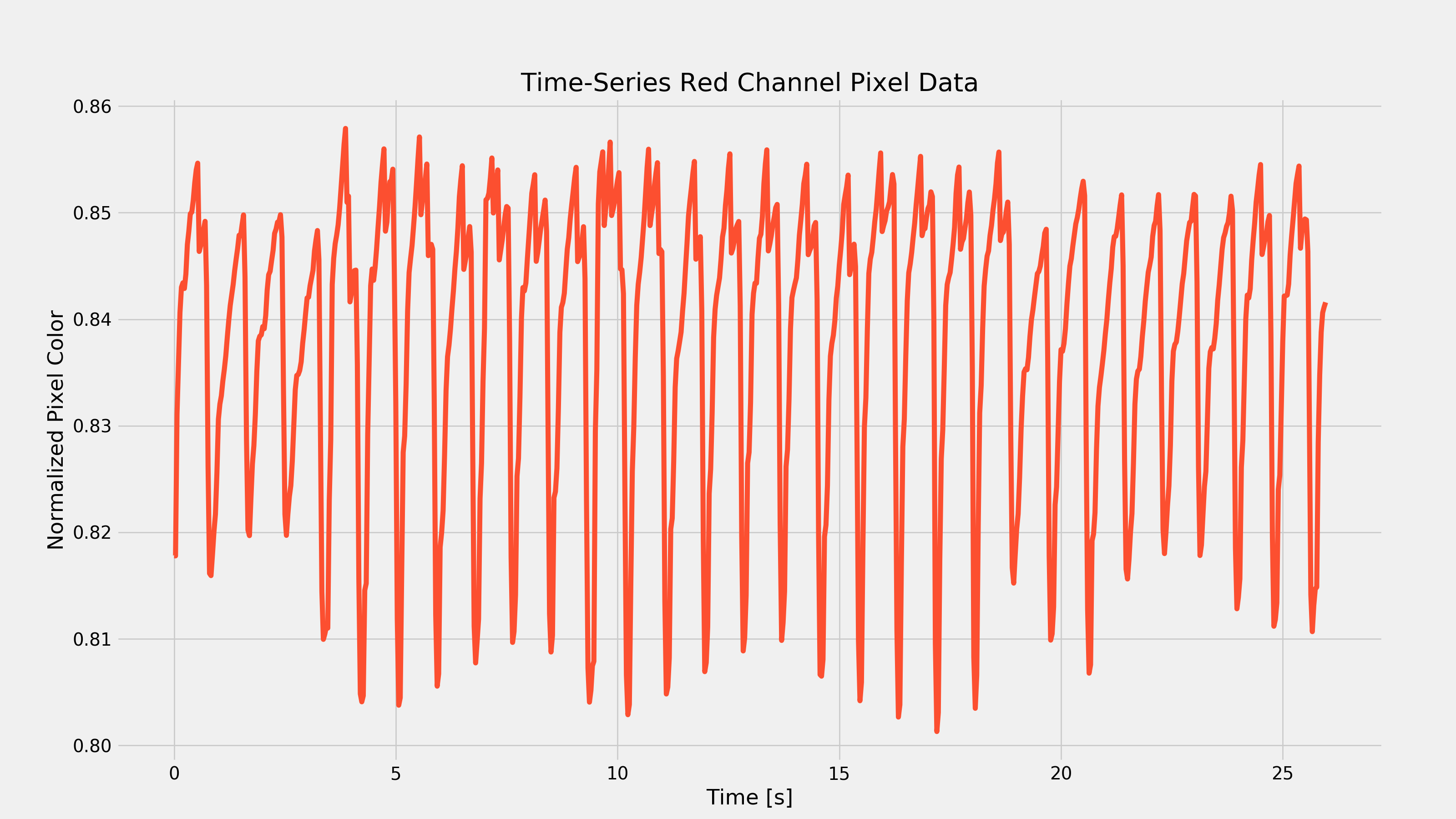
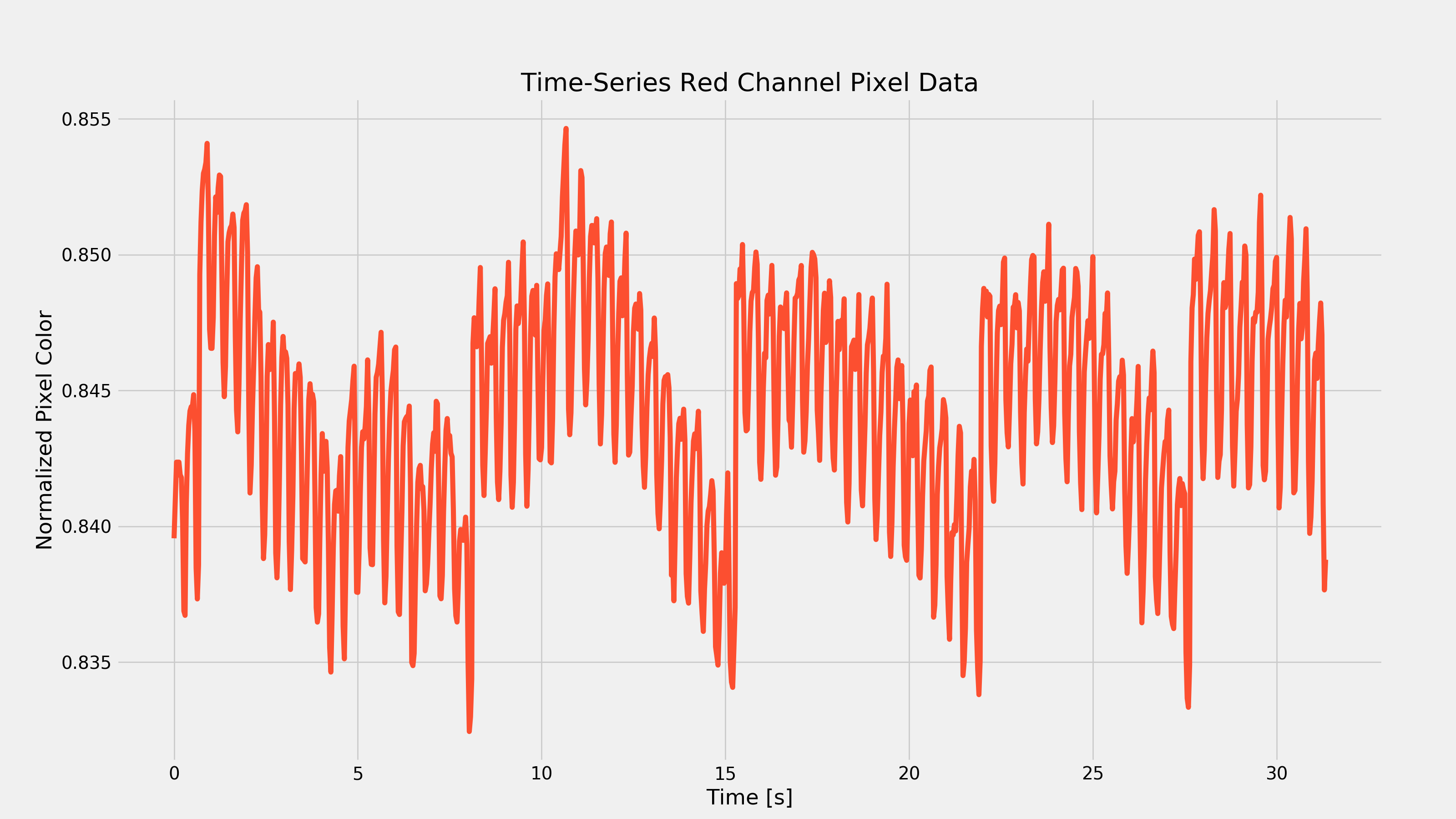
Next, we actually need to plot the graph. Your output should look similar to the graph below. Note that this is the result extracted from my Nexus 5X and is representative of my resting heart-rate. Yours will look different, but the characteristic oscillations should be apparent (and have a period of about 1s… how surprising).
plt.figure(figsize=(16,9))
plt.plot(x, colors['red'], color='#fc4f30')
plt.xlabel('Time [s]')
plt.ylabel('Normalized Pixel Color')
plt.title('Time-Series Red Channel Pixel Data')
fig1 = plt.gcf()
plt.show()
plt.draw()
fig1.savefig('./{}_time_series.png'.format(filename), dpi=200)
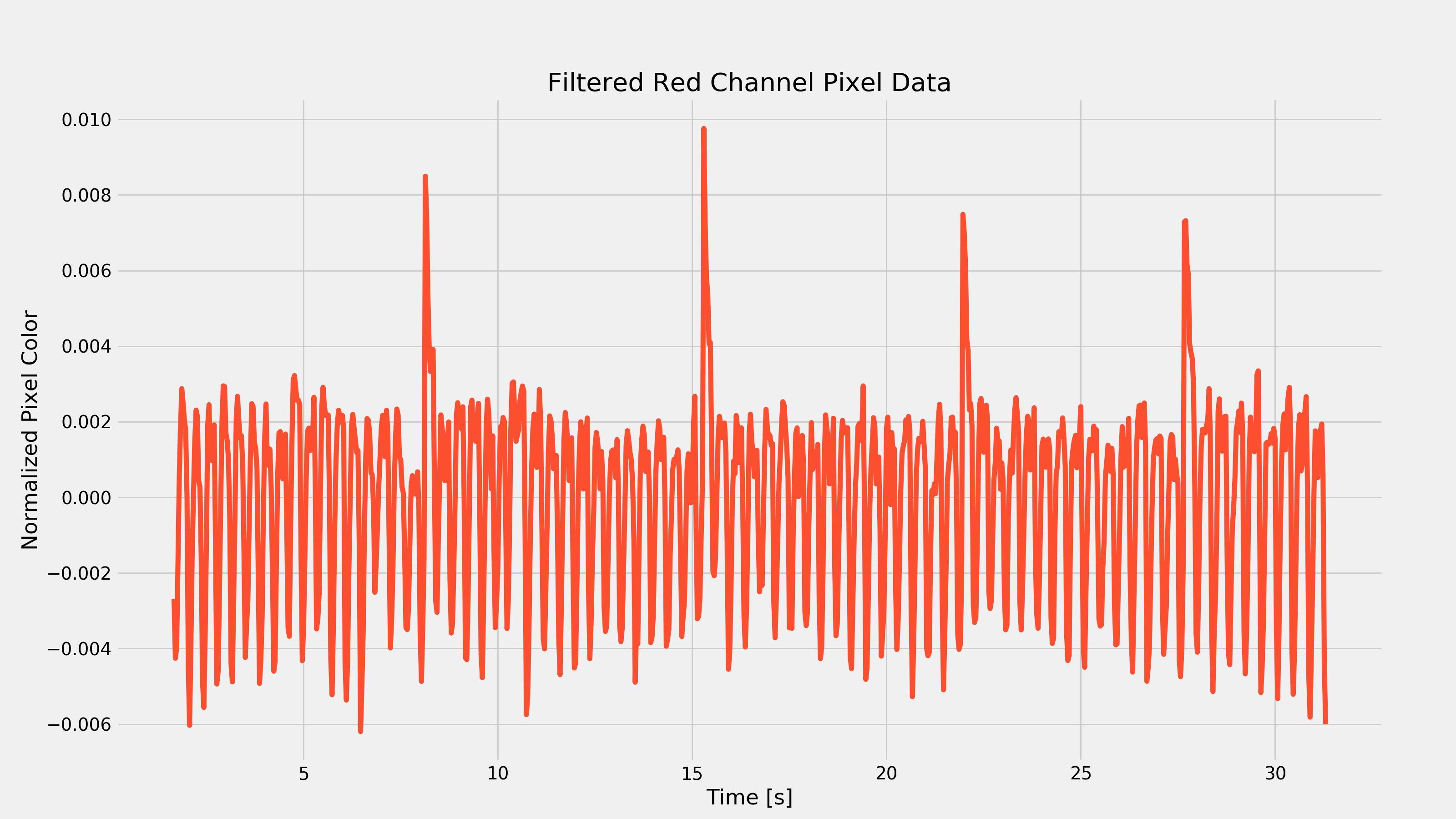
Filter the Data
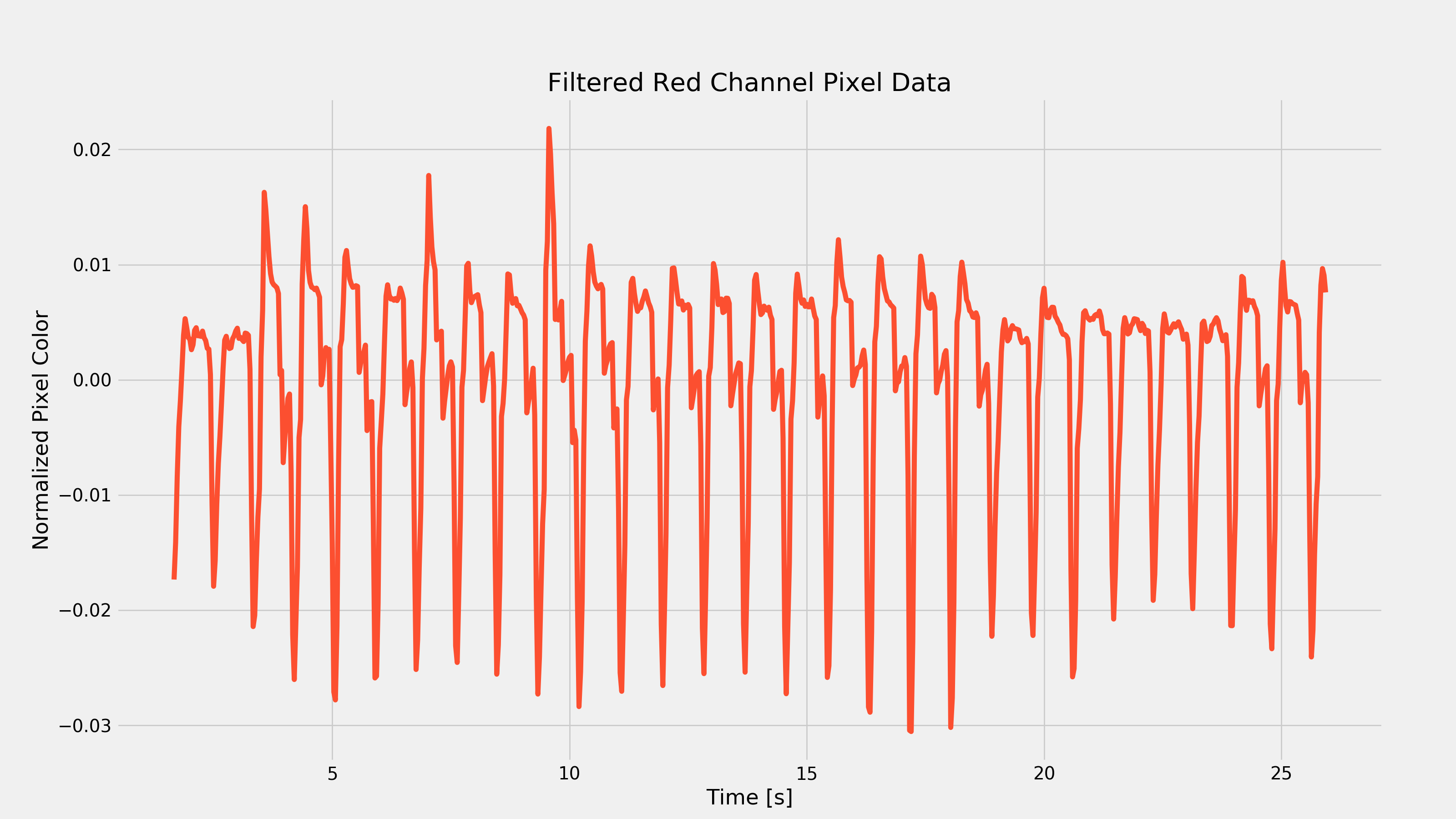
You’ll notice that there are a few important features of the above plot. First, we see those oscillations which should represent our heart-rate; we’re going to need a way to calculate our heart-rate based on this time-series data. The next thing you might notice is the fact that there is some extra low-frequency behavior (most noticeable towards the bottom peaks). This actually represents respiratory rate (among some other things) but we are going to want to remove this low-frequency behavior and only include the high-frequency stuff. This suggests the use of a high-pass filter (given an input, only allow the high-frequency portion to pass through to the output). Now, the time-series plot I have above doesn’t have much low-frequency behavior, so you could even get away without filtering (but as I’ll show later, different activity levels can produce very different results, so filtering can be required in other cases).
Given that our setup is pretty rudimentary, we don’t need anything too fancy for filtering- a simple derivative will usually work. I ended up taking it a bit further to implement an actual simple HPF. For me, it produced slightly cleaner results, but by all means experiment for yourself!
colors['red_filt'] = list()
colors['red_filt'] = np.append(colors['red_filt'], colors['red'][0])
tau = 0.25 # HPF time constant in seconds
fsample = fps # Sample rate
alpha = tau / (tau + 2/fsample)
for index, frame in enumerate(colors['red']):
    if index > 0:
        y_prev = colors['red_filt'][index - 1]
        x_curr = colors['red'][index]
        x_prev = colors['red'][index - 1]
        colors['red_filt'] = np.append(colors['red_filt'], alpha * (y_prev + x_curr - x_prev))

# Want to truncate data since beginning of series will be wonky
x_filt = x[50:-1]
colors['red_filt'] = colors['red_filt'][50:-1]
And now we can plot this derivative to see a more spiky-looking plot.
plt.figure(figsize=(16,9))
plt.plot(x_filt, colors['red_filt'], color='#fc4f30')
plt.xlabel('Time [s]')
plt.ylabel('Normalized Pixel Color')
plt.title('Filtered Red Channel Pixel Data')
fig2 = plt.gcf()
plt.show()
plt.draw()
fig2.savefig('./{}_filtered.png'.format(filename), dpi=200)
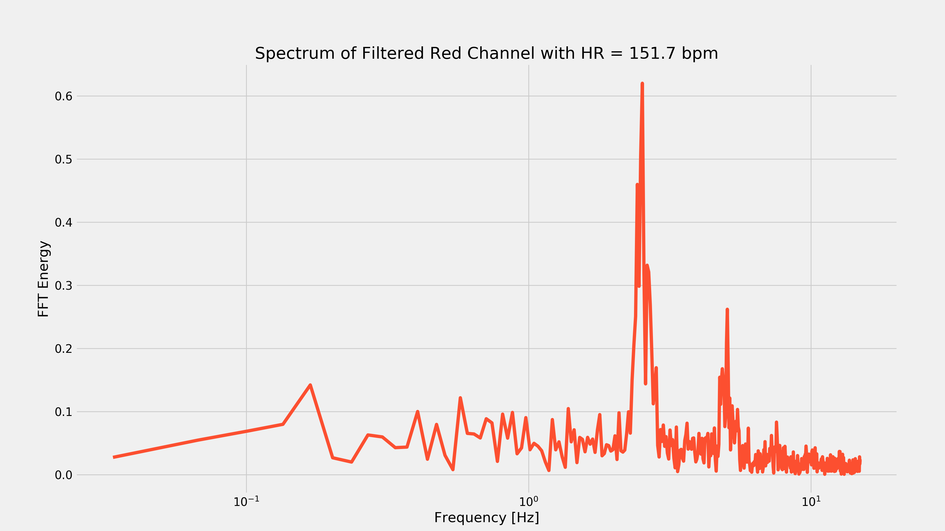
Extract Frequency Information
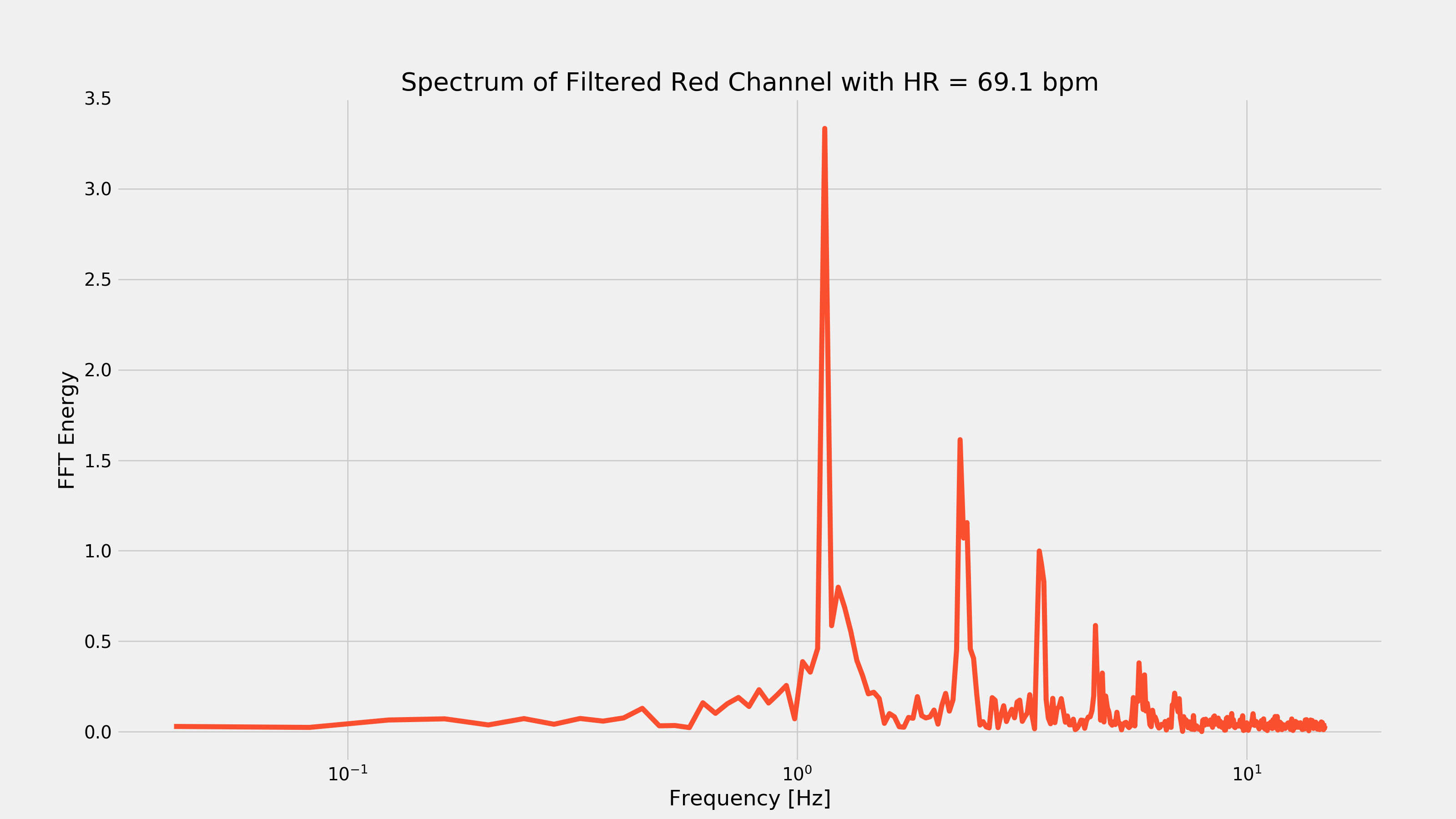
Now, I have read some papers that indicate what I’m about to do degrades the heart-rate reading, but I don’t care. Those aforementioned papers seem to prefer implementing a peak-detection algorithm to count the peaks over a given time frame to extract the heart-rate (in essence, implementing a frequency counter). I’m opting for an FFT. Why? It’s super easy and gives a great visualization for the frequency components in the PPG reading. We can simply find the peak of the FFT and that should correspond to the strongest spectral component: our heart-rate. That statement will only be true thanks to our filtering in the previous step (otherwise some low frequency components may end up being more dominant, which is not what we want).
Taking the fft is easy: we just use the fft function built into numpy. The next step is to find the largest spectral component and figure out what frequency it occurs at. Once we know which frequency it’s at, we multiply by 60 seconds per minute to convert Hz to beats-per-minute (bpm).
red_fft = np.absolute(np.fft.fft(colors['red_filt']))
N = len(colors['red_filt'])
freqs = np.arange(0,fsample/2,fsample/N)

# Truncate to fs/2
red_fft = red_fft[0:len(freqs)]

# Get heartrate from FFT
max_val = 0
max_index = 0
for index, fft_val in enumerate(red_fft):
    if fft_val > max_val:
        max_val = fft_val
        max_index = index

heartrate = round(freqs[max_index] * 60,1)
print('Estimated Heartate: {} bpm'.format(heartrate))
> Estimated Heartrate: 69.1 bpm
And we’ve got our heart-rate! We can also plot the FFT to see what this looks like in the frequency domain.
plt.figure(figsize=(16,9))
plt.semilogx(freqs, red_fft, color='#fc4f30')
plt.xlabel('Frequency [Hz]')
plt.ylabel('FFT Energy')
plt.title('Spectrum of Filtered Red Channel with HR = {} bpm'.format(heartrate))
fig3 = plt.gcf()
plt.show()
plt.draw()
fig3.savefig('./{}_fft.png'.format(filename), dpi=200)
Heart-rate After Cardio
After waiting for my wife to leave the room, I started running around like an idiot in an attempt to elevate my heart-rate to ensure that the above code would work with a different looking PPG waveform. After about 15 minutes, I took another video and recorded the response of my index finger. After running it through the above code, I got the following plots:
As you can see from the first plot, removing the low-frequency component was pretty important as there was that very strong low frequency change every seven seconds or so. That frequency component would have made it hard to extract the heart-rate.
Final Thoughts
The idea of using your camera + flash as a heart-rate monitor isn’t novel in any way. In fact, there’s even apps you can download that will do this that have been available for years. However, this is a really easy way to get familiar with PPG sensing and what the characteristic waveforms look like with real examples. The fact that the hardware barrier doesn’t exist (seriously- who doesn’t have a smartphone in 2017?!?) makes it a cool experiment anyone can perform in a couple hours on the weekend which is very cool.
If you liked this post, don’t be afraid to share it!